

ADDRESS
Khurrampur, Farrukh Nagar, Haily Mandi Road, Gurgaon, Delhi (NCR)
Data Visualization
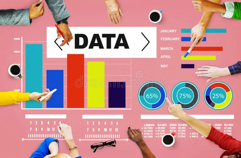
Data visualization is the graphical representation of information and data in a pictorial or graphical format (Visualization of Data could be: charts, graphs, and maps). Data visualization tools provide an accessible way to see and understand trends, patterns in data, and outliers. Data visualization tools and technologies are essential to analyzing massive amounts of information and making data-driven decisions. The concept of using pictures is to understand data that has been used for centuries. General types of data visualization are Charts, Tables, Graphs, Maps, and Dashboards.
Data visualization can be utilized for a variety of purposes, and it’s important to note that is not only reserved for use by data teams. Management also leverages it to convey organizational structure and hierarchy while data analysts and data scientists use it to discover and explain patterns and trends
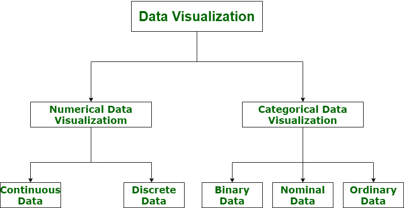
Performing accurate visualization of data is very critical to market research where both numerical and categorical data can be visualized, which helps increase the impact of insights and also helps in reducing the risk of analysis paralysis. So, data visualization is categorized into the following categories:
Let’s understand the visualization of data via a diagram with its all categories.
Data visualization can be used in many contexts in nearly every field, like public policy, finance, marketing, retail, education, sports, history, and more. Here are the benefits of data visualization:
Storytelling: People are drawn to colors and patterns in clothing, arts and culture, architecture, and more. Data is no different—colors and patterns allow us to visualize the story within the data.
Accessibility: Information is shared in an accessible, easy-to-understand manner for a variety of audiences.
Visualize relationships: It’s easier to spot the relationships and patterns within a data set when the information is presented in a graph or chart.
Exploration: More accessible data means more opportunities to explore, collaborate, and inform actionable decisions.
There are plenty of data visualization tools out there to suit your needs. Before committing to one, consider researching whether you need an open-source site or could simply create a graph using Excel or Google Charts. The following are common data visualization tools that could suit your needs.
Tableau
Google Charts
Dundas BI
Power BI
JupyteR
Infogram
ChartBlocks
D3.js
FusionCharts
Grafana
Date : 07 Oct, 2023

Data Visualization

WEB DESIGNING
10 Nov, 2019
view gallery
PHP

AUTOCAD 2020
DIGITAL MARKETING
OFFICE 365
10 Nov, 2019
view gallery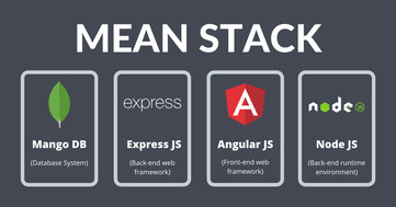
MEAN STACK
10 Nov, 2019
view gallery
SOLID WORKS 2016
10 Nov, 2019![]()

REVIT STRUCTURE

JAVA TRAINNG
10 Nov, 2019
view gallery
HTML TRAINING

WEB DEVELOPMENT

EMBEDDED SYSTEM
10 Nov, 2019
view gallery
Embedded Hardware

C Language
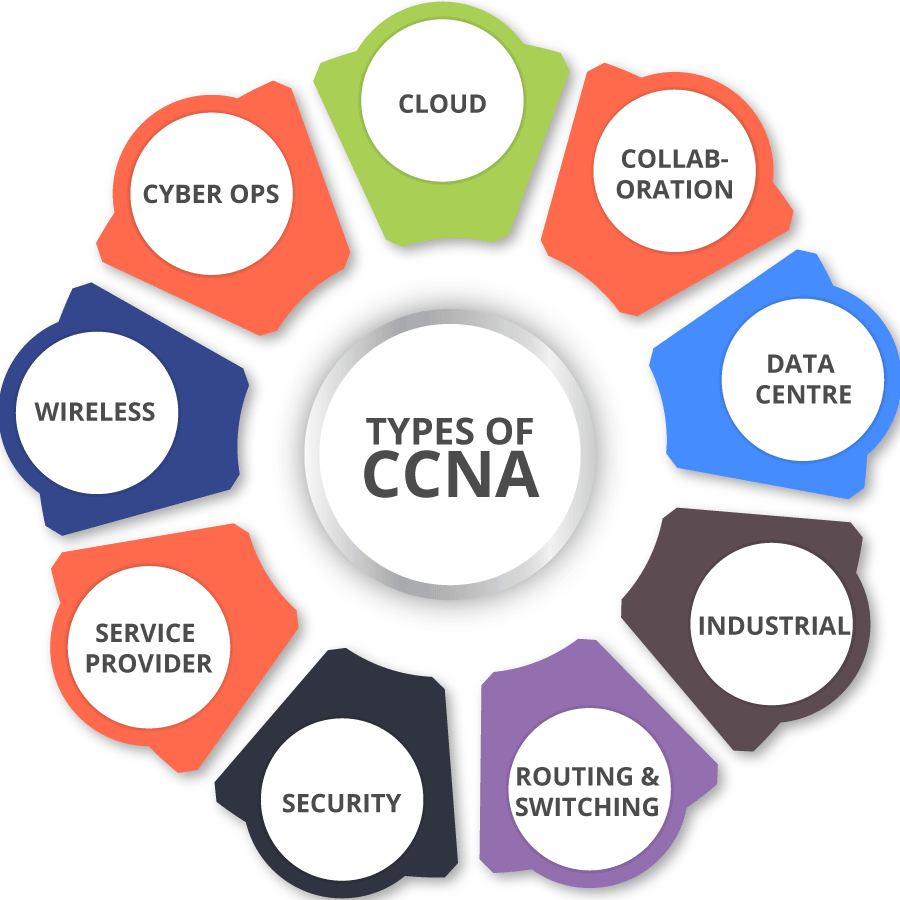
CCNA

Tax Auditor
10 Nov, 2019
view gallery
Entrepreneurship Development Program
Finance Manager

Database Administrator

System Administrator
10 Nov, 2019
view gallery
Information System Manager

Computer Science Technology

Computer and Information Research Scientist

Computer Network Architects

Information Security Analyst
10 Nov, 2019
view gallery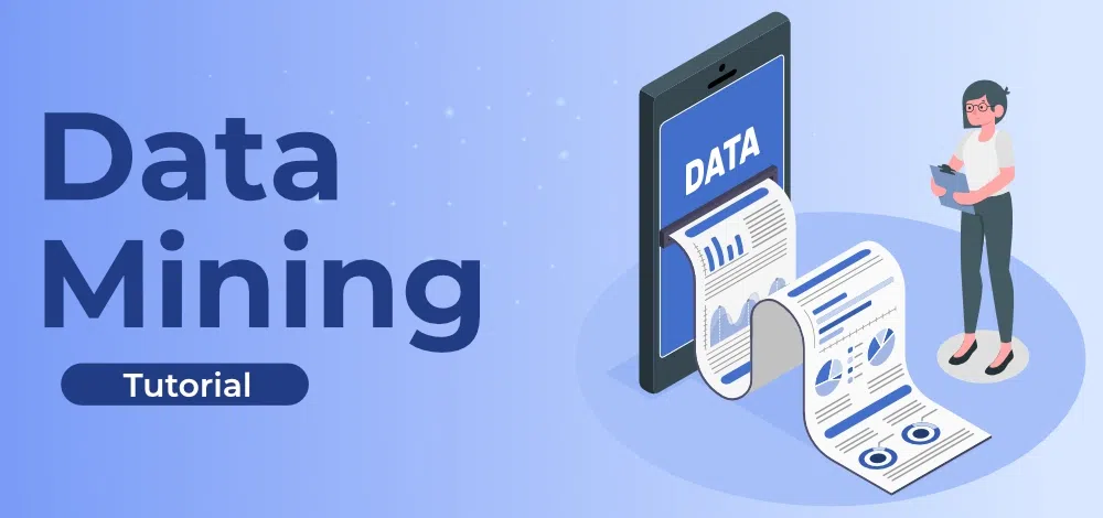
Database Administrators and Architects
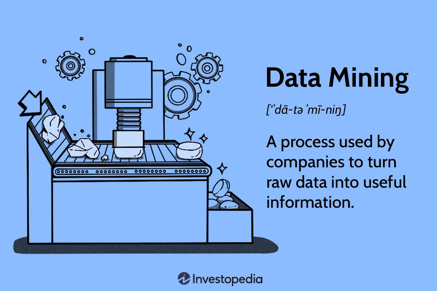
Data Mining

Deep Learning

Computer Vision

Machine Learning

Big Data Analytics

Neural Networks
Statistics Mathematics

Wealth Management and Financial Planning
10 Nov, 2019
view gallery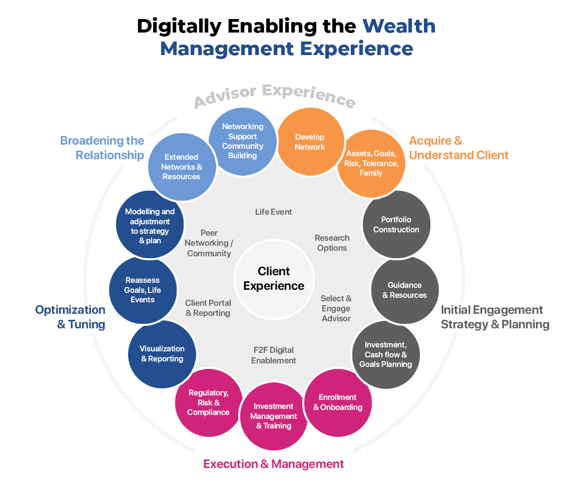
Financial Derivatives
10 Nov, 2019![]()

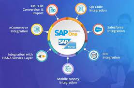
SAP ERP

Personality Grooming

Recruitment Process
10 Nov, 2019
view gallery
Service Engineer
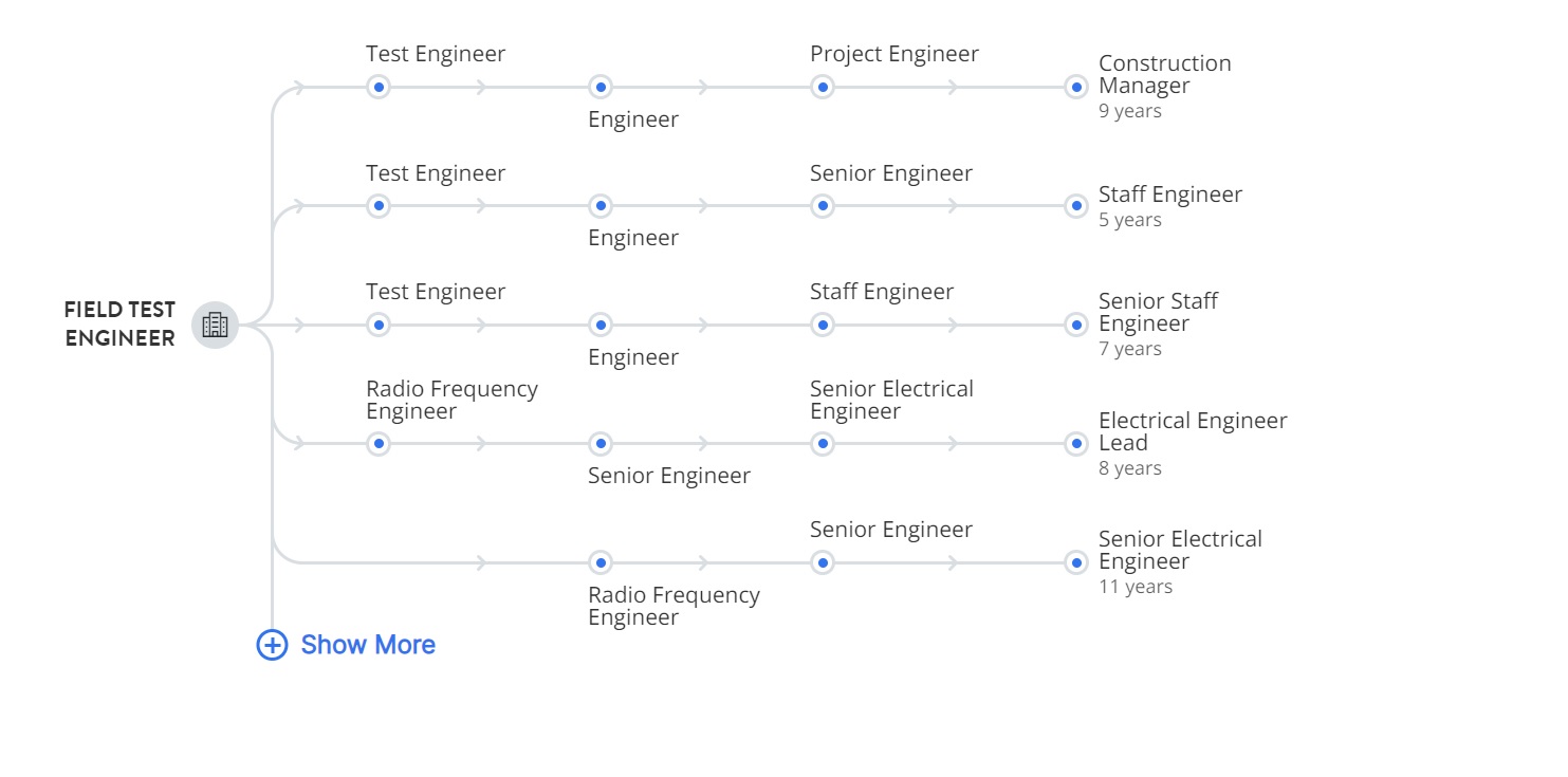
Field Test Engineer
10 Nov, 2019
view gallery
Technical Director
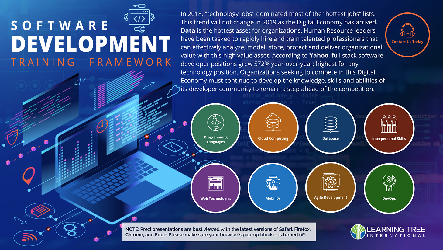
Software Developer

Programmer Analyst
10 Nov, 2019
view gallery